
How to Create a Great Consulting Website (Guide)
 15 MIN

When searching for information or the answer to a question, the internet is usually someone’s first stop. The more specific the search query, the better the results a search engine will display. A company that ranks well in those search results can see a significant boost in business. Every business—from solo consultants to established corporations—should have a website. A website serves as an effective marketing tool that helps independent consultants spread brand awareness, enhance credibility, showcase skills, and reach new clients.
GATE
However, simply having your own website is not enough. No matter how creative, or content-rich a website is, it won’t deliver the desired results without a strategic plan. Fortunately, you don’t have to be tech savvy to create or optimize a website. You just need to follow the critical steps outlined in this guide.
Simply having a website is not enough. No matter how creative, or content-rich a website is, it won’t deliver the desired results without a strategic plan.
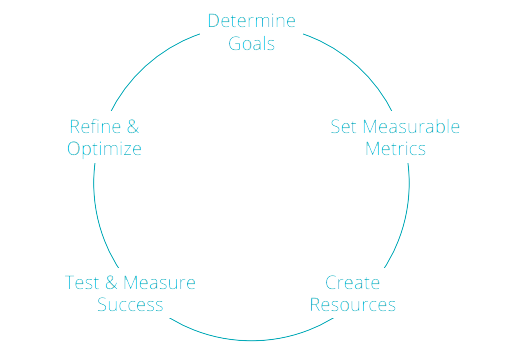
How to Develop a Website Strategy
Determining your goals and overall marketing strategy will influence your website structure and content. Before you create your website, identify the goals you want to achieve and develop a strategy to meet those goals. If you’re an independent consultant, your goal may be to earn more business, showcase your existing work, or become a thought leader, for example.
Ask yourself these questions:
- Who is the target audience for my website?
- What will they expect to learn from my website?
- What type of information will be valuable to them in determining if I am the right person for the job?
Know your value
Once you’ve determined your audience, ensure that your website showcases your skills, credibility, and industry knowledge.
Ask yourself these questions:
- Which skills have helped me win projects?
- What is my competitive edge and what do I need to include on my website to help me stand out from other independent consultants?
- Do I have certain skills or expertise I can easily describe?
- How have I helped my clients solve problems in the past, and how can I quantify or highlight my results?
Develop measurable goals
Remember, your website is a marketing tool—and you need to regularly measure its effectiveness.
Goals to consider include:
- Attract prospects: Visitors come to my website and read about me and my services
- Generate leads: Visitors come to my website and complete a contact form, download a resource, or contact me
- Create engagement: Visitors come to my website and participate in a discussion on a certain topic (through a forum or through comments on a blog post)
- Promote your brand: Visitors come to my website to learn about my skills and success
- Establish thought leadership: Visitors come to my website to read informative content because they are inspired by my ideas and want to learn more from me
The primary difference between leads and prospects is engagement. Prospect engagement is a one-way street—prospects visit your site and then leave. In contrast, lead engagement is a two-way street. When leads provide you with information via a contact or content form on your website, they open the door to further engagement. After optimizing your website, consider developing an engagement strategy to nurture these leads and win new business.
The primary difference between leads and prospects is engagement.
Establish KPIs (Key Performance Indicators)
After you establish your goals, think about how you will measure your success. Many goals are measurable using your website data. Google Analytics is a powerful tool that can be used to focus on these metrics to track important metrics.).
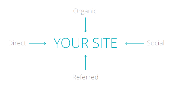
Channels: Google Analytics data will show how many visitors are coming to your site from multiple channels, such as organic, referred, social, and direct sources.
- Organic traffic means visitors came to your site by typing a search query into a search engine.
- Referred traffic means visitors were referred to your site through another website.
- Social traffic means visitors came to your site through a social channel such as LinkedIn, Facebook, or X (Twitter).
- Direct traffic can come from a variety of sources. As a rule of thumb, Google labels traffic as “direct” if the source of the traffic is not clear.
Users: The number of unique users who visited your website.
Unique pageviews: The number of unique users who viewed a page.
Pages per session: The average number of pages a website visitor views during a session. In general, a session ends after 30 minutes of inactivity on your site.
New vs. returning users: Shows the number of new visitors compared to returning visitors. Returning visitors are only considered to be returning if their previous visit is tracked or “cookied.”
Time on site, time on page, and session duration: Metrics that determine how much time users spend on your website or on a specific page.
Exit rate: A high exit rate on any page suggests that users are unsure of what to do next after landing on it. To keep users on your site, provide a clear next step such as a link to another page.
Form completions: If you include forms on your website, it’s a good idea to send visitors who complete the form to a “thank you” page. If you look at how many times your “thank you” page was viewed, you will know how many forms were completed.
If this is your first website, you’ll need to allow data to accumulate for a month or two to establish a benchmark. After that time has passed, you can optimize your site in different ways and compare the results to see if your website is becoming more effective.
Determining who your audience is will help you tailor website content to provide your targeted visitor with exactly what they need to engage with your business. Don’t rush through this important step.
How to Create Your Website
Website creation tips
Once you’ve thought carefully about your website goals and how to promote your business, you can work on the actual creation of your website.
This includes:
- Selecting a platform and domain name
- Determining pages and content types
- Creating content
- Optimizing a suite of components
- Technical setup and deployment
Don’t sweat the small stuff
Many consultants get hung up in the design stage on logo creation, colors, or font choices. While these elements are important, consider building a website like building a house. If you find yourself stuck on which shade of blue to use before you’ve built your website, it’s like being stuck on the color of your front door before you’ve built the foundation for your home. Start by getting a framework in place. Review templates you like and start with something simple. You can always expand on your framework once you discover what does and does not work for your business—particularly if you’re going the DIY route.
Select and register a domain name
When selecting a domain name for your website, choose something simple, such as FirstNameLastName.com or YourBusinessName.com. Try to stick as close to your name or to your business’s name as possible and opt to use .com—the most common domain type—if at all possible.
This will enhance the credibility of your business and make it easier for your current and prospective clients to remember.
Choose a website platform
Creating a professional website is much easier than you may think. Easy-to-use online platforms with stock images and pre-formatted templates allow you to create a unique website with your own personal brand and feel for as little as $10 per month. Two of the best platforms on the market are Wix and Squarespace, which offer easy-to-use designs and require little technical skill to implement.
These platforms are perfect for websites that don’t require complicated features and have few pages. For content-heavy websites, consider using WordPress, the most popular content management system on the market. WordPress offers robust features and publishing capabilities. It’s popular among website designers, making it easy to find someone to build your website for you if you need support.
Strikingly is another powerful option for people looking to get online fast. With free and premium options available, Strikingly allows you to directly import your LinkedIn profile to create a simple, one-page site to showcase your accomplishments.

Create pages and content types to satisfy your strategy and goals
While it’s important to be creative and to stand out among your competition, there are standard website components you should include.
- Home page: Your home page is the first page that visitors will see when they type in your domain name. This page should have critical information about what you do as a consultant. You should briefly describe what kind of consulting business you have and the types of services you offer.
- About me page: Your About Me page should have information about your experience, education, and skills. Using bullet points is an excellent way to show this information as most website readers would rather skim than read through paragraphs of text.
- Contact me: You should always provide website visitors with a way to contact you. You can either list contact information or include a form for them to complete, which will send a message to your email address. Additionally, consider including a professional headshot.
Now, think about other pages you could add to promote your services. Here are just a few ideas you might consider:
- My services: Add a page that lists your service offerings. This list can be as long or as short as you’d like, but it’s better to use a bullet point format for easy viewing.
- Current and past clients/projects: This is an excellent way to showcase projects you have completed and clients you have worked with in the past. If you have client permission, use company logos and include results and achievements from these partnerships.
- Testimonials: If you have client testimonials, this is a plus. If you can directly quote the testimonial along with the person’s name, title, company, and photo, this will validate your work and promote your skills.
- Samples of work: Have you created any case studies, reports, blog posts, books or any other samples of work that you can show website visitors? Consider including a thumbnail image of any of these with links to full reports or posts. This will keep visitors on your site and allow them to learn more about you ultimately boosting your credibility.
Design tip: If you’re looking for images to use on your website, consider stock photography sites like istockphoto.com where you can purchase stock imagery for a small fee. Many sites like Squarespace also have image libraries that you can browse and purchase.
Content creation tips
When writing content for your website, be crisp, clear, and precise. Describe what you do and what value you will offer clients without resorting to jargon or vague, flowery text. When possible, demonstrate results from your past clients.
Consider:
- Content length: Pages should have no more than 300 to 500 words. When possible, show and don’t tell by using a video, chart, or infographic.
- Copy style: Organize content so that it is easy to read, such as the bulleted list we’re using now.
- Voice & tone: Write like you would speak. If you work in a creative industry, humor may be the right approach. If you’re targeting a suit-and-tie audience, write with a more formal tone.
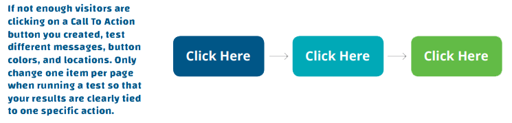
- Calls to action: Make it easy for potential clients to take the next step. When possible, show a contact form, offer a downloadable asset, or indicate where to go next.
The average attention span online is 8 seconds. That’s less than the attention span of a goldfish (9 seconds). Don’t write a novel!
Optimization
Optimization is not only the process of creating an “optimal” experience for users on your website, but it’s also the technical term behind how your website can be best positioned to rank on sites like Google. For each page you create, you’ll be able to “optimize” by filling in the following fields in most content management
systems or website platforms:
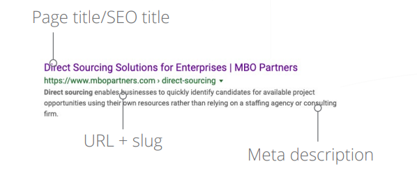
SEO title: In addition to a page title, you may have the option to enter an SEO title. This title should catch the searcher’s eye and motivate the person to click the link to your website. Use clear, user-friendly titles with no more than 55 characters, including spaces, as this is what users will see in search results when they enter a page.
Example: Website Optimization for Consultants
Meta description: When your website comes up in search, the meta description appears right below the link. This will be one or two sentences (135 to 155 characters) that describe what the page or your site is about. The meta description should include keywords that you know people are searching for.
Example: Amy Smith offers brand and digital marketing services to small businesses in the Washington, DC, area.
Slug: A slug is the part of the website URL that appears after your website name. Be sure to use keywords in your slug that describe what the page is about.
Example: AmySmith.com/Digital-Marketing-Services or AmySmith.com/Contact-Me
Navigation: These are the selections, usually at the top of your site, that allow the visitor to click to view different parts of your site. In other words, navigation is how your information is organized. Your website visitors should be able to easily navigate through your site and find the information they’re looking for. Keep your navigation titles brief yet informative, ensuring your visitors know exactly what to expect on the page they navigate to.
Linking: Linking your pages of content lets Google know how your content works together. For example, on your “About me” page, include a link to your services page. Your services page can link to your testimonials page, etc. Links to external pages can also be useful so long as the pages you link to are credible sources of information. However, remember that clicking on an external link will send users outside your site, and the goal is to keep them on your site for as long as possible.
Calls to action
Including a “contact me” page on your website is critical—it should be easy for leads to contact you. A call to action (CTA) is an image or line of text that prompts website visitors to take some sort of action such as completing a form, downloading an eBook, or signing up for a webinar. CTAs come in many forms, from popup windows and social media icons to simple buttons or forms. Most website templates will include a CTA button, allowing you to tailor the message for maximum impact.

Use a site like GoDaddy.com to secure a custom name for your site. Most domain names cost about $15 per year. Depending on your website host, the cost of this domain may be ‘baked in’ to your website build costs.
How to Market Your Website
Drive visitors to your website
It’s important to have a clear understanding of what your target audience is searching for. Keywords are words and phrases that users type into a search engine to find websites that match what they are looking for. Some keywords get thousands of unique searches per day, while others may only get one or two a month.
Choosing the right keywords to use on your website can drive all important organic (search) traffic to your site. Although you may feel that you know your industry and your audience, you may be surprised at which keywords are used in Google search.
Competitive searches
Run a basic Google search for your type of business. For example: “Washington DC marketing consultant.” See which websites come up. Continue to type in different search terms, becoming more specific as you go along. This will help to narrow down the terms that you determine are relevant to your business and ensure that your website appears alongside similar results.

Keyword planner
Just to double-check that you have chosen the best keywords for your site, we highly recommend you use Google’s Keyword Planner, located within Adwords.Google.com. You can use the planner to type in a variety of keywords and see average search volume, competitiveness of certain keywords, and how much people are paying to rank for those keywords.
You should aim for keywords that have decent search volume but aren’t overly competitive. The goal is to have your site rank for these keywords when searched. Rank refers to your website’s position in the search engines for a particular keyword. The closer your rank is to No. 1, the easier it will be for visitors to find your website in the search results when they type in that particular keyword.

How to Measure Your Success
With any marketing program, it’s essential to set goals and measure how well you’re achieving them. To track the effectiveness of your website marketing efforts, key Google Analytics metrics include unique users (visitors), traffic by channel, exit rate, pages per session, session duration, and conversions. Keep an ongoing spreadsheet of website changes and their dates to compare results over time.
Tracking search terms that are driving traffic to your site is crucial for determining if your keyword optimization efforts are effective and if you’re attracting the right audience. Additionally, tracking shares and likes of your content through social media outlets can help measure its popularity and measure brand awareness. Also, keeping count of the number of followers on social media can help you review your status as a thought leader.
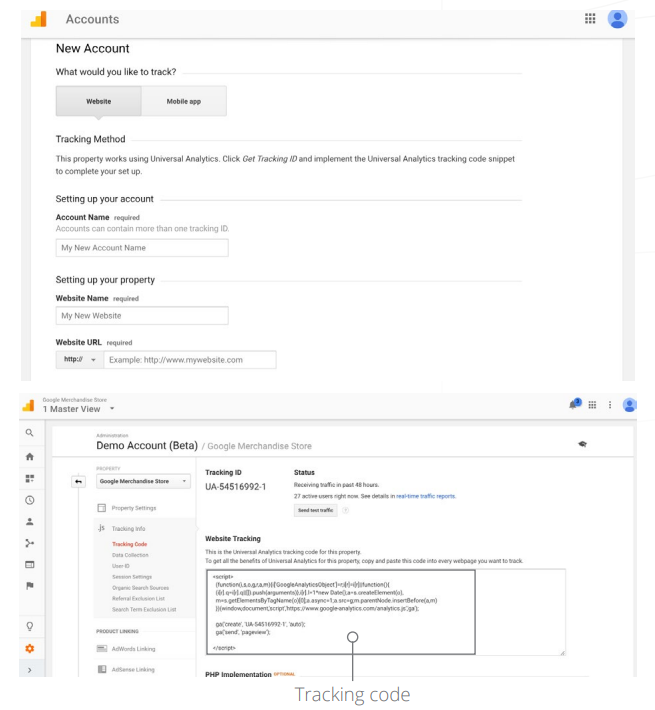
How to set up Google Analytics data tracking on your site
Google Analytics is a free analytics tool for your website that gives you valuable site data. To set up a Google Analytics account and get a tracking code for your site, follow these steps.
- Create a Google Analytics account: Go to analytics.google.com, sign in with your Google account, and click “Start measuring” to create an Analytics account.
- Set up a property in GA4: Name your property (e.g., “My Website GA4”), select your reporting time zone and currency, then click “Next.”
- Configure data stream (web/app): Choose “Web” to set up tracking for a website, then enter your website URL and a stream name (e.g., “My Website Stream”). GA4 will generate a Measurement ID for your web stream.
- Add the GA4 tag to your website: Use Google Tag Manager (recommended) or add the GA4 tag (Measurement ID) directly to your website’s HTML. Place the tag within the <head> section of your website to collect data.
- Set up events & conversions: GA4 automatically tracks several events (page views, scrolls, clicks, etc.). To track specific actions, go to “Events” in your GA4 property, set up new events, and mark key ones as “Conversions” if desired.
- Verify tracking: Confirm that GA4 is collecting data by using the “Realtime” report. Open your website, and ensure user activity appears in the report.
When measuring the success of your website, you want to consider quantity and quality. It is not enough to increase traffic, although that is a goal worth having. The more important metric is quality—making sure the quality of your traffic and leads is meeting your expectations and goals.
How to add the tracking code
The tracking code must be added to every page of your website for Google Analytics to gather its data. This is typically done by injecting the code onto each page through an advanced page setup. While it generally involves cutting and pasting the code on to your page, the process varies depending on which platform you use. If you search for help within your platform, there should be instructions available
Google’s search console
For Google to access your site’s content and gather data, you will need to link a Google Search Console account with your analytics account. The Google Search Console can also be used to ask Google to crawl and index your site. Requesting that Google index your site will allow your new content to show up on a Google search much faster than waiting for Google’s scheduled crawl.
The Google Search Console also lets you monitor search terms that have brought visitors to your site organically. You can see the click-through rate of search terms, the number of page impressions, and gather other useful data.
To set up a Google Search Console account:
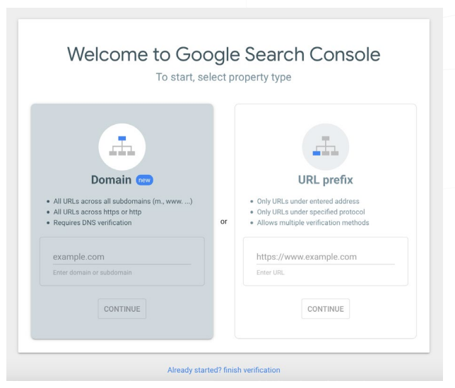
- Go to Google’s Search Console
- Click “Start Now”
- Enter your domain name under “URL Prefix” and click “Continue”
- After your site has been verified, click “Go to Property”
For Google Analytics to gather data from the Google Search Console, you need to verify that your site is linked between the Google Search Console and Google Analytics.
To link your site between the Google Search Console and Google Analytics:
- Sign in to your Analytics account.
- Click “Admin” at the bottom left of your screen.
- In the Property column, click “Property Settings.”
- Scroll down to Search Console and click “Adjust Search Console.” You should see the URL of your website, which confirms that the website is verified in the Search Console and that you have permission to make changes. If you do not see the URL, you need to add your site to the Search Console.
- Under Search Console, select the Enabled view(s) in which you want to see Search Console data.
- Click “Save.”
When measuring the success of your website, you want to consider quantity and quality. It is not enough to increase traffic, although that is a goal worth having. The more important metric is quality—making sure the quality of your traffic and leads is meeting your expectations and goals.
How to Test and Learn
Now that you have created your website with a clear strategy and goals, it is important to reach those goals. Once a month, take some time to assess your traffic metrics, identify areas for improvement, and make changes to your site. Here are a few ideas of what to look for:
- Pageviews: Pageviews can indicate which topics or types of content visitors are most interested in. If some of your web pages are being viewed more than others, figure out why those are popular while others are not.
- Keywords: Which keywords have brought traffic to your site? Are those the keywords you have been targeting? Are they relevant to your site? Consider creating more content around keywords you think are important and that you can rank for.
- Leads: Have you been getting enough leads from your site? If not, consider tweaking the way you describe your services. Try different headlines and sub-headlines, change the format of your content, and change meta descriptions to prompt more action.
Make changes, wait a week or two or even a month and record your results, and then adjust accordingly.
In this guide
Subscribe to the Insights blog to get weekly insights on the next way of working

Join our marketplace to search for consulting projects with top companies


Learn more about MBO
Learn how to start, run and grow your business with expert insights from MBO Partners
Learn how to find, manage and retain top independent contractors for your projects.

MBO Partners publishes influential reports, cited by government and other major media outlets.
Research and tools designed to uncover insights and develop groundbreaking solutions.